Coffee Maker
refreshing and redesigning around pre-existing components
This was a passion project I worked on during the summer of 2019
about
This project all is about refreshing a pre-existing design to cater to a more modern aesthetic. Careful consideration was given to ensure the new design did not impeded on the functionality on any of the original internal components.
Research
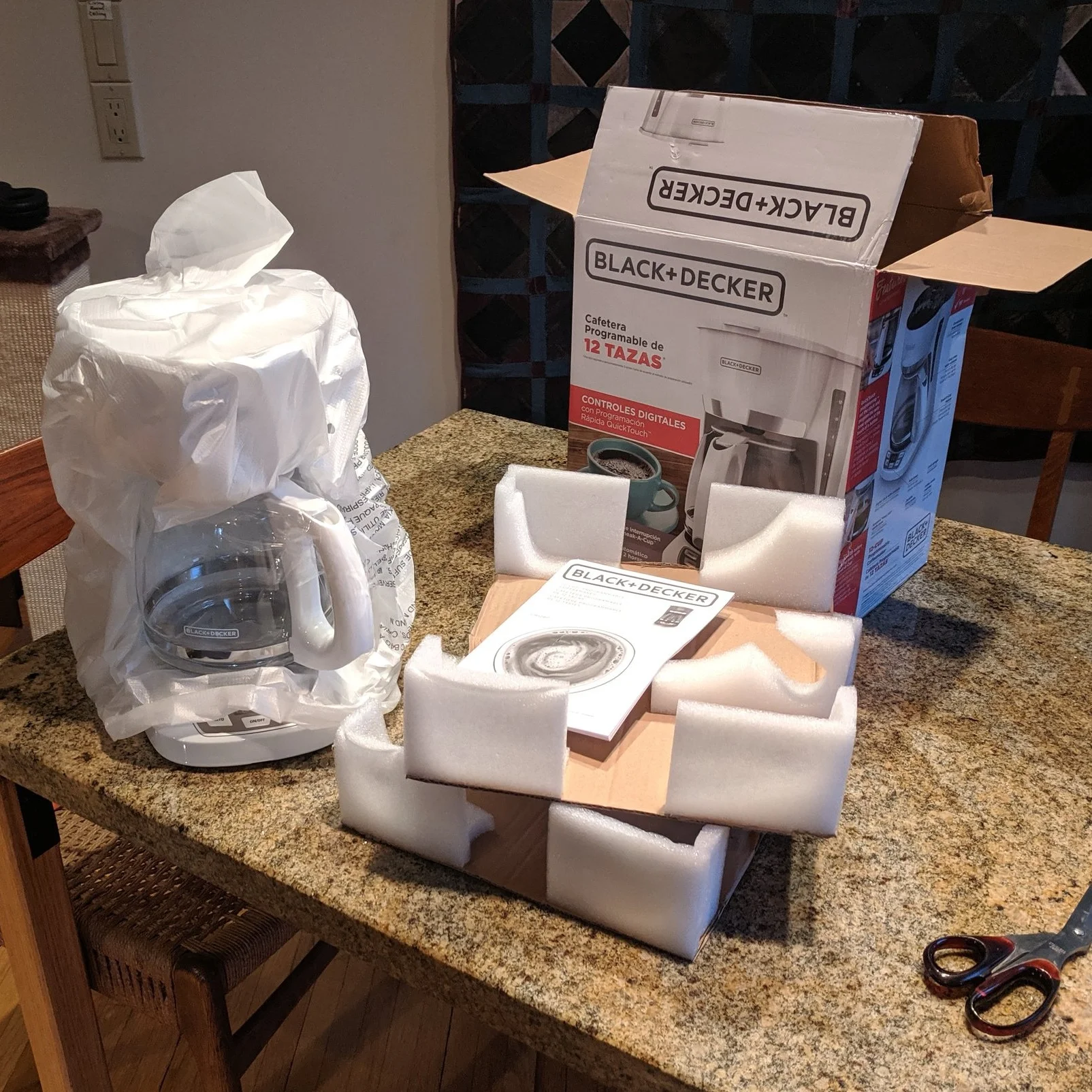
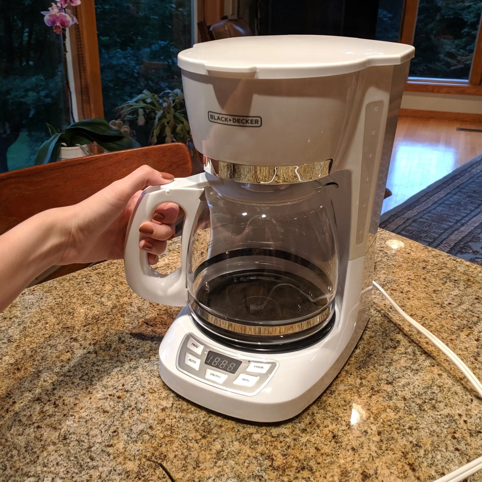
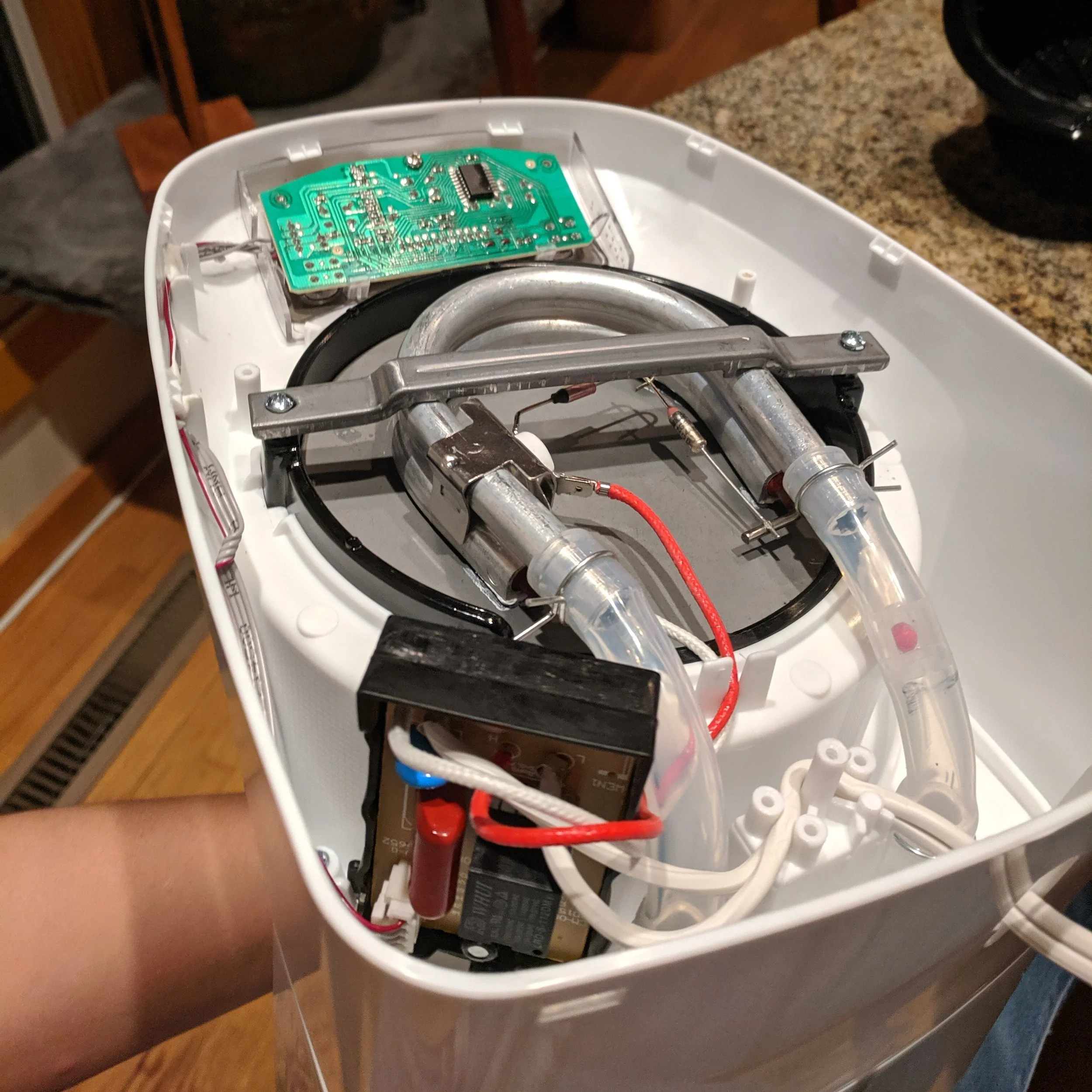
To start off this project, I bought this Black & Decker coffee maker at Target for $19.99 to better understand the components I had to work around. By taking this coffee maker apart, I could see how it was constructed and what about the materials, components, and design drove it to this twenty dollar price point. My goal with this redesign was to maintain its low manufacturing cost while being able to market it at a much higher price point because of a revamp in its design aesthetics.
inspiration
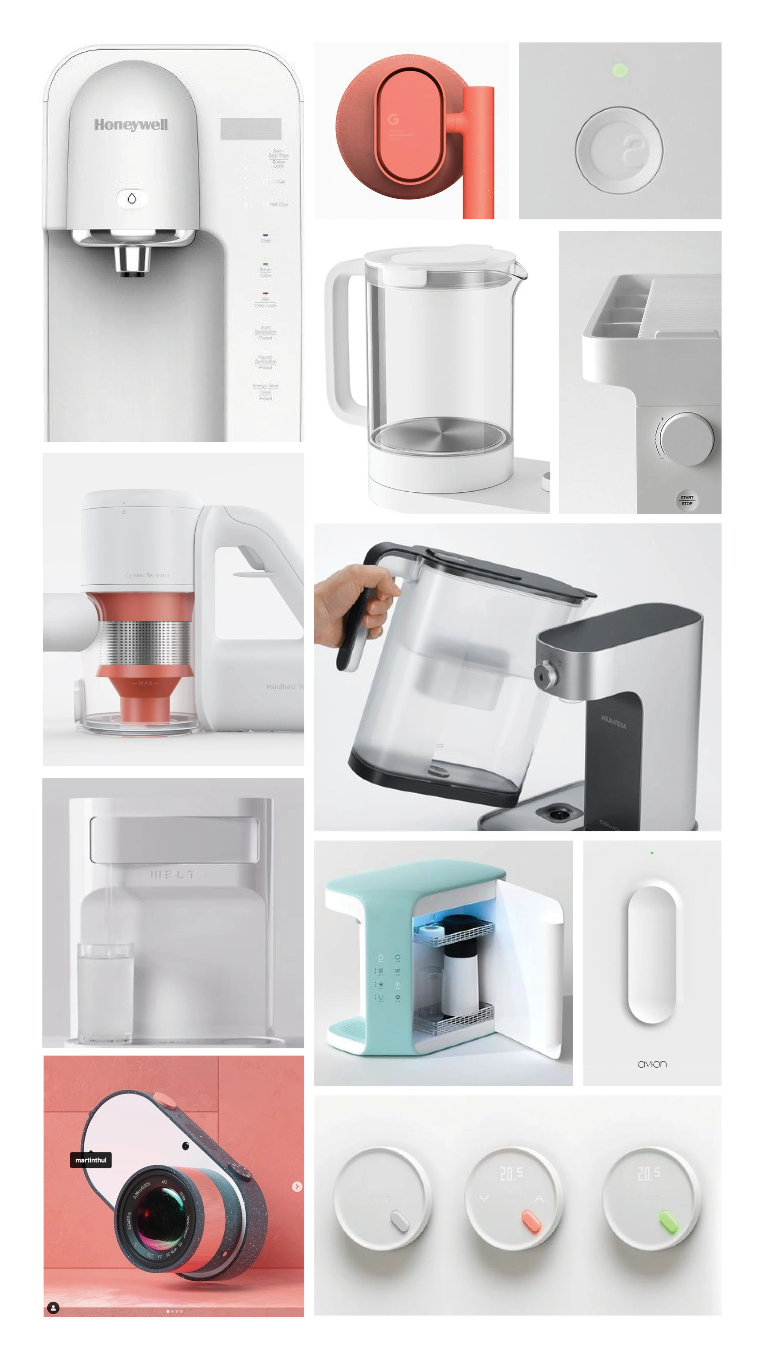
Soft and round forms, light and playful colors, and translucent materials is what I saw was trending in home appliances and was what I wanted to emulate in my design.
Early Development
To get my ideas out before I forget them, I like to do a quick round of quick and dirty sketches and mini clay models. In this case, the clay models helped me to visualize things in 3D that I might not appreciate as much on paper. At the end of the day I was excited about this rectangular shape because of its simplicity and modern feel.
Full Scale Foam
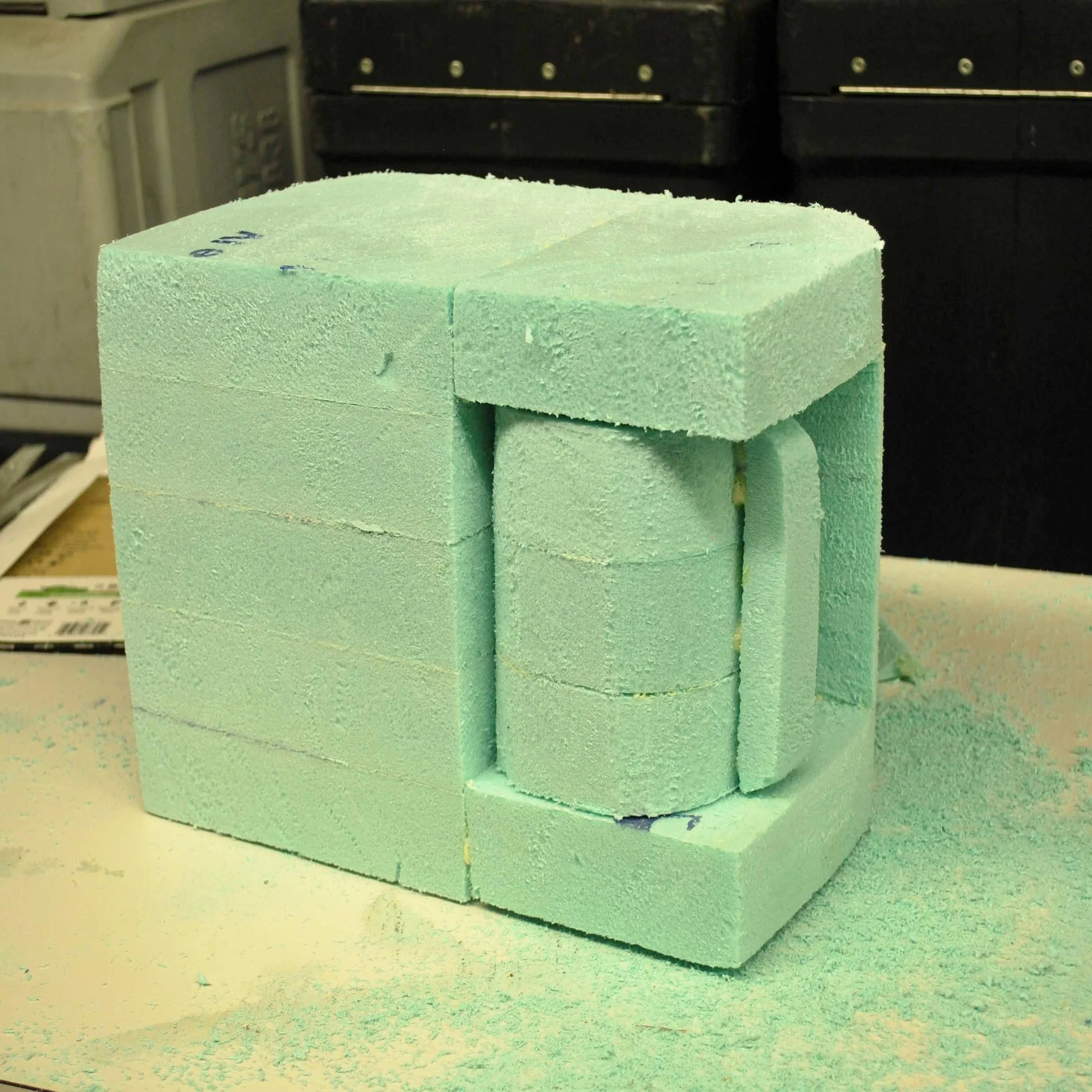
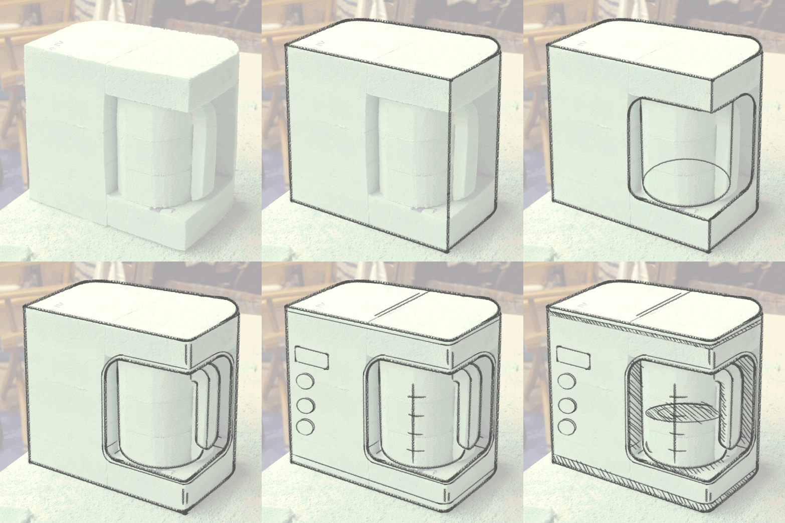
Working in full scale allowed me to understand my design more thoroughly. At this point I was starting to be able to visualize my final design as well as understand what still needed more work.
refined sketches
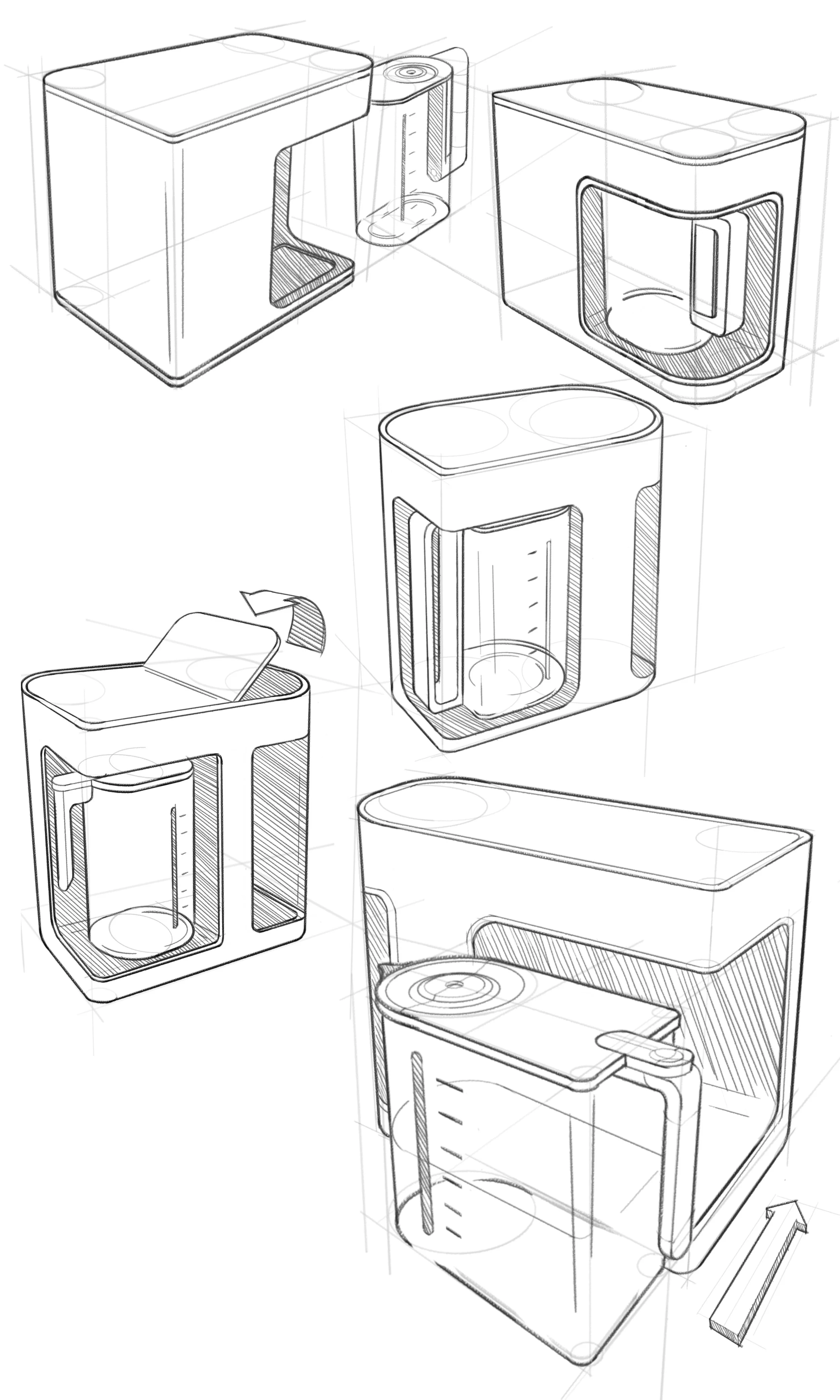
Before jumping into CAD, I felt it was necessary to spend a bit more time thinking about the details of this project. How large should the filleted corners be? What about the shape of the carafe? And how should the water tank be shown - should it be seen from the outside at all? These were all questions that I felt could be answered most effectively through some more refined iterative sketches.
CAD
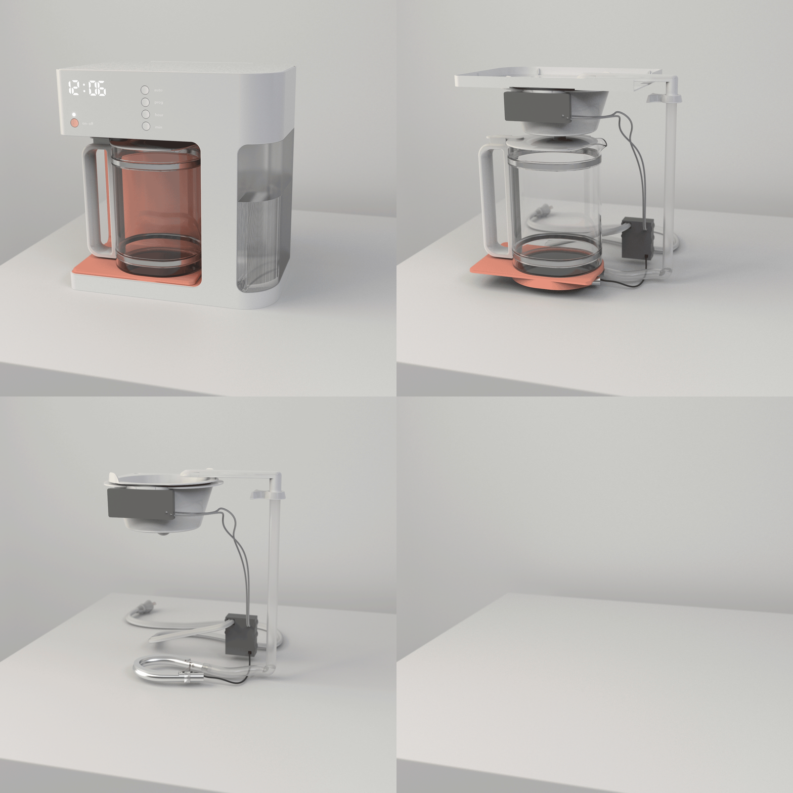
This model and all of its internal components were made in Fusion 360. At this stage, I found it beneficial to model the internal components first and then design around them. Creating the coffee maker in this order would ensure that I wasn’t going to make something that wouldn’t be functional in the real world.
Internal components and renderings
Packaging design
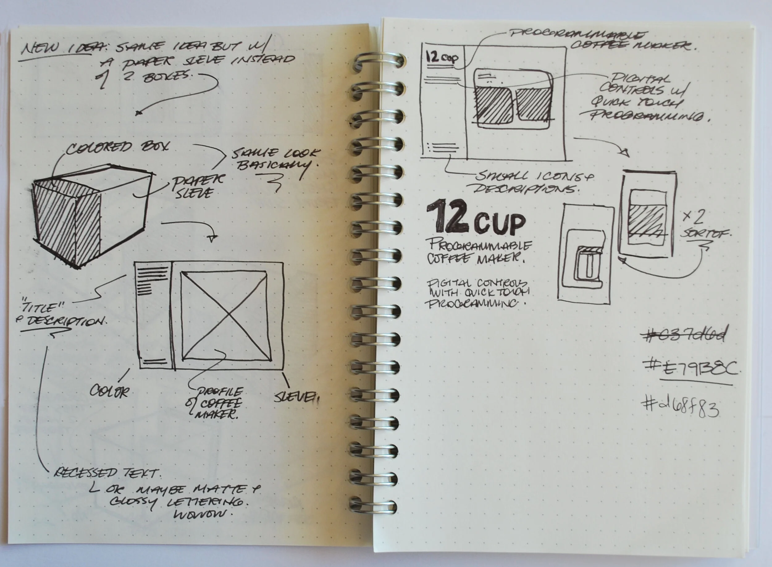
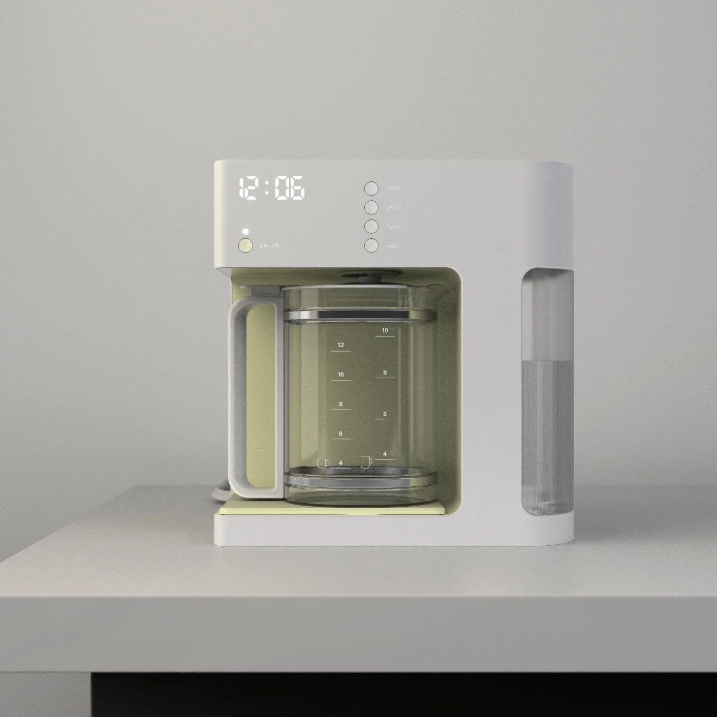
This package design is sleek and simple just like the coffee maker. The cardboard box is color coded to the color of the coffee maker and there is a complementary paper sleeve that wraps around the box.
final product
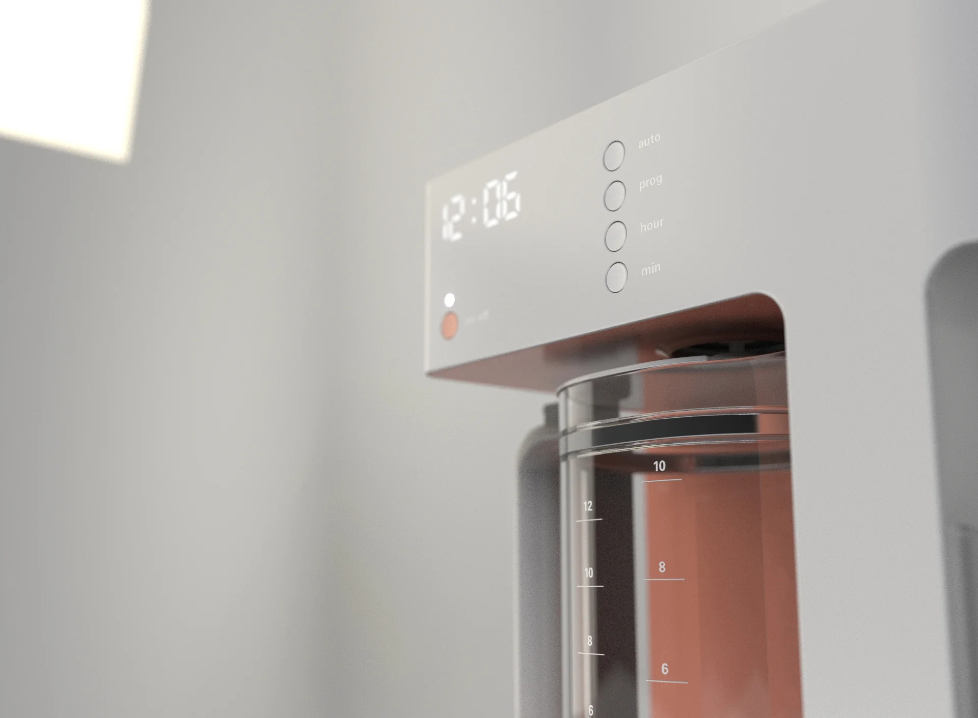
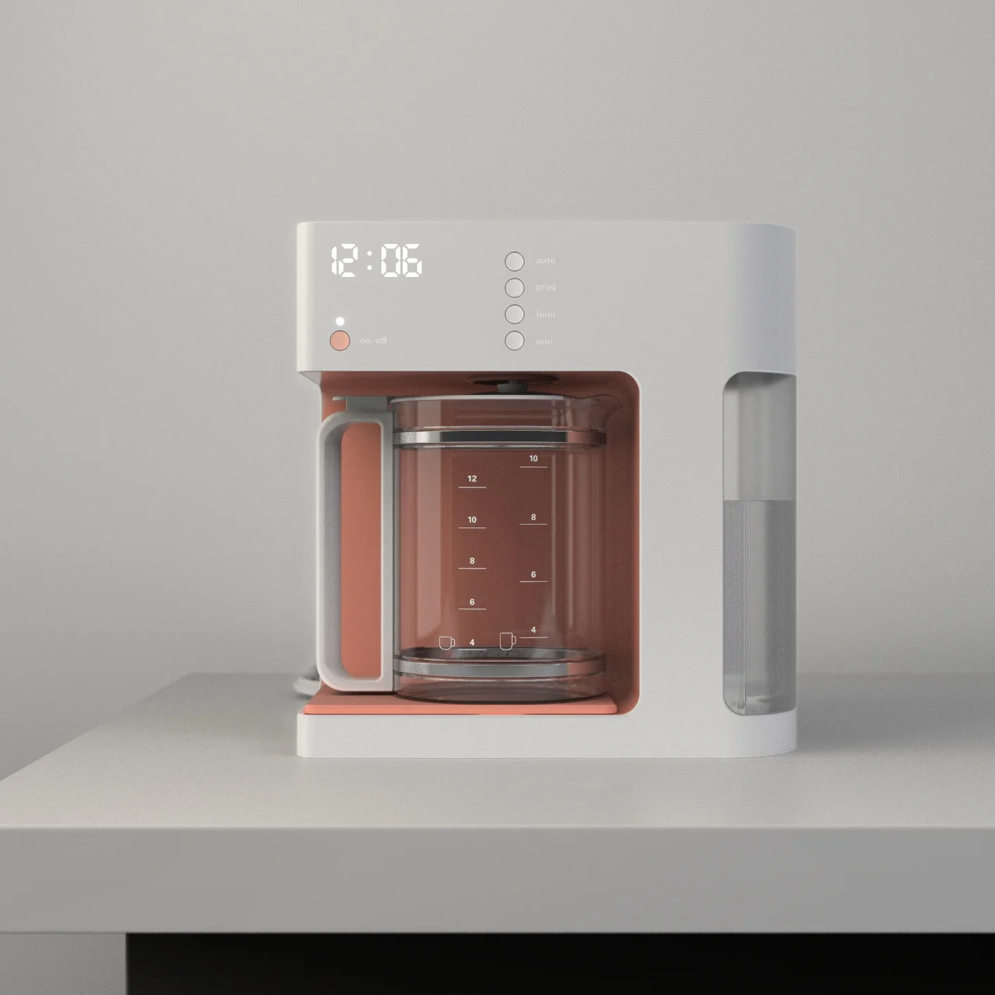
This product is a more trendy take on the coffee maker I started with. My coffee maker was designed with the pre-existing components and manufacturing processes (injection molded plastic) of the original coffee maker in mind. Because of this, my design could be produced for about the same cost and could generate a higher profit because of its premium looking design.

